Description:
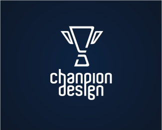
Sorry in advance folks. I wasn't satisfied with my previous versions and I shunned it for several weeks. Now its has resurfaced and I'm quite happy with this version. Its bolder, simpler, and more contemporary. Initials C and D incorporating the cup once again. Your comments are most welcome. Cheers.
Status:
Nothing set
Viewed:
12219
Share:

Lets Discuss
i agree, Its bolder, simpler, and more contemporary. %26 the type goes with it perfectly! i'd say you were done with this mate!**you commented on one of my showcases that you couldnt illustrate mate, ive seen your showcase dude its full of really good illustrations??**ps ive left a msg for ya in the forum.
Replythis is good chanpion I think you have nailed it. Love the typography and love the simple shape of the cup...good work dude.
ReplyChanp, yeah I like this one, The type looks great but compared with trophy the contrast seems a little heavy if that makes sense? I know it's the same line weight but perhaps it can be reduced ever so slightly, OK I'm being nit picky sorry.
ReplyThanks and thats perfectly fine nate. Its good to be picky. Thats how we get closer to perfection! I'll reduce the thickness a little bit just for you bud!**Thx nido and mcd. I have my site to design so I thought I had better get this finalised.
ReplyHey Chanpion I really like your work. I just wanted to comment on this one since it's your personal Logo. The trophy is great (C%26D), however I think that this free font 'Aldo' got a bit overused since it came out I have spotted it on many flyers websites and other places. I find it easy recognizable and my suggestion is that you try to customise the 'G' ,although is a nice one, but it's the most distinctive. Considerning your skills I think that your personal mark will turn out geat :)
ReplyHmm...thanks tish. Very good point. You're right. It's a nice font but it is abit overused, isn't it. I might go and tweak it abit. I've spent so much time on the mark that I've overlooked the font. Great suggestion. Thx again.
ReplyHey Chanpion...IMHO I wouldnt be changing it all that much and I have seen Aldo in use a few instances along with helvetica, Intersate...Neuropol...the list goes on, but in each instance thay had there own own unique look and feel which is the case here. if you feel you need tweak it, take the 'd' flip it vertically and add a little curve at the end and hey presto. As I said earlier I think you have nailed and its by fare the best...so good luck
Replyyeah a flipped and customised 'd' should work fine :)*'mcdseven'- Neuropol is another good example of overuse and wrong use, but I don't see how Helvetica can be put in the same list !
ReplyTishbite...you are joking? Dont know what design world your from Dude..but if you look up a lot of logos designed for medium/larger companies with a corporate feel across the world, different weights of Helvetica/Helvetica Neue is used quite consirably, a far lot more than Ray Larabies Neuropol (which had a couple of years in fashion). And I never said it was used wrong, just said that it is used a Lot. Cheers Dude %3B-)
Reply'mcdseven'-I really don't want to explain to you what the difference between Helvetica %26 Neuropol is, but it's not in how often they are used :) Cheers
ReplyWell Tishbite why dont you explain to me the difference between Helvetica and Neuropol? I am very interested to know...
Replymuch better...very refined and well executed. I like.
ReplyThx ahab. Me like your Harris too. Been missin' your work bud. Must be busy which is definitely a good thing! Cheers.
ReplySolid identity, dude! One question - is the 'D' part of the mark slightly (very slightly) thicker than the 'C' part? Or maybe my eyes are playing tricks on me. Look at me being all nit-picky. Looks great!
ReplyHey Kev. thanks mate! How are you doin? Actually after you said that I went and blown it up to see whether it was the case. I remember using the the 'C' part to make the 'D' but guess what? You're right, the top and bottom stroke on the 'D' is a fraction off! Man, ya gotta stop puttin your nose against the monitor dude %3B ) I thought I was bad. Thx again mate.
Reply%22Man, ya gotta stop puttin your nose against the monitor dude %3B ) I thought I was bad.%22***I know...sometimes I annoy myself. :-P Anyways, I'm doing well, man. Thanks!
Replynicely done dude ... congrats :)
Replythe most colorful feature ive ever seen! well done chan the man!
ReplyHey Chanp. Congrats on your feature and on your wonderful, amazing and inspiring work!*Keep it up, mate.
ReplyYeah,congrats on being featured.This rocks:)
ReplyBOUT TIME! BTW I love the end results. Congrats Chanp you do brilliant work my friend.
ReplyHOLY COW! My heart skipped a beat when the home page was refreshed! I swear, you can never get used to the feeling of being recognised for your work. Its just as fresh and appealing everytime!**I can honestly say that interacting with the MANY GREAT designers on this site has since lifted my game in design.**Enjoyed every minute here. Thanks everyone and hats off to Colin and David for providing to us such an awesome and inspirational site. As someone once said, %22...virtual beers all around...%22. Cheers.
ReplyCongrats on having your showcase featured!
Replycongrats on the showcase. I was just looking over you marks and remembered our %22argument%22 over the NOAH mark. Hope you still have that beer waiting on me.
ReplyThanks Jeff. You would never know how many times I view your showcase. The reminescence value alone is well worth it.**Ahh Brian, I wouldn't call that an argument mate. Its beer..I mean water under the bridge pal. And yes, after I shout you a coupla schooners then we'll have a real argument %3B ) Cheers bud.
Replyget a room
ReplyLOL!
ReplyI just keep coming back to see this logo like a bad crack addiction. by far one of my favorites.
Replyreally nice Icon :)
ReplyFlows very well, I love it!
ReplyI like it, C and D not easy to see but I like a lot :D
ReplyThx mosti!
ReplyGood to see you around again. Missed ya and your work.
ReplyNice design. Clever animation in the avatar as well.
Reply@the Lege: Thx Mike, its good to be around again. Love your new website mate. Miss the duck though %3B-)**@devey: thx for the compliment!
ReplyNice job. I think this could easily be developed into a modern crest too!
ReplyI really love your avatar, and work.
ReplyThx Jonny and Rudy! Both your showcase rocks.
ReplyHello,
ReplyI like your design a lot. I am looking for someone that can help design my logo for my own business website. Is this something you will be interested in?
Thanks,
Derek
email sent to your website! :)
ReplyFor the longest time I read your name as 'Champion.' Now it really stands out!
ReplyHaha thanks Nash! Everyone thinks it a typo until they find out my name. Cheers bud.
ReplyDaily Laughs!!
ReplyWhat's the reasoning for the h and the d connecting?
Reply^ funny question :)
ReplyNice Lines! Thumb up ;)
ReplyPlease login/signup to make a comment, registration is easy