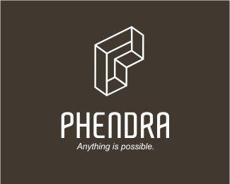
Description:
For a logo comp. Phendra is a consulting company that focuses on helping internet startup’s with online strategy for user growth. This initial version is Escher inspired and I was accused of 'stealing' this idea (http://www.logolounge.com/wd/uploads/408_pm2.jpg)in the comp's posting. I like to hear your thoughts.
Status:
Nothing set
Viewed:
8218
Share:

Lets Discuss
This is much better! (Retracting my previous drunken statements!)
ReplyMy question is this: If you know that something similiar to this exists? Why design yours in the same fashion?%0D*%0D*Why not work towards something unique? Are you saying the other idea came after yours?
ReplyLook, no ill feelings towards you Bart. Like I said, it was more of a slap in the face comin from you thats all. If it was unintentional I'm cool with that. I can take any criticsm good or bad but when accused of 'stealing', that just boiled my blood abit. Like I said, your work is top notch and if it was said in an unsobered frame of mind, I think I'll give you the benefit of the doubt. Cheers pal.**Now Craven, to answer your question simply, I DIDN%22T know there was something similar existed. I might have an ounce of feeling that the 'style' (Escher) light be around other designs but had I realised that the Paradox logo had incorporated the same style into the alphabet 'P', I gaurantee you I would have steered well clear of it. There was a progression to this design, not one that was drummed up instantly. Cheers mate.
ReplyAll this fussin and feudin...lets all hold hands and sing 'we are the world' altogether now.**Looks great Chan...but I think a better choice of typeface can be used..no disrespect to Aldo. I just feel it doesnt belong to the mark..where a more swiss based style would.
ReplyThanks Paul. Problem is, I can't sing to save my life %3B)**You're probably right about the type choice. I too have had enough of 'Aldo'. We'll see what happens. Thanks pal.
ReplyNo problems Chan (we'll put you on percussions)...having a look at your showcase, very, very impressive, you have some tasty work there. What ever happened in the end with Cummins Corp?
ReplyAn eye candy right here!**Way to go! %3B )
ReplyThanks again Paul. In regards with Cumminscorp, since the pitch I have not heard from them yet but they did say it will take awhile. Will keep everyone updated as soon as I hear from them. Thanks for asking bro.**Thanks Art. Congrats on a marvellous showcase.
ReplyHey Chanp, I'm returning the compliment, I love your showcase, just beautiful.**Cheers
Replylove this logo! The mark totally communicates the tagline. Great use of %22MC Escher%22 perspective. Great typography. Super impressive showcase! **Nice work Chanpion.
ReplyMarvellous timing, David :D**
ReplyGday Julian, hows things?**Timing? but thanks David.
ReplyLol great logo.. Im totaly confused now.. How is it possible :)
Replylove the forms!
ReplyPlease login/signup to make a comment, registration is easy