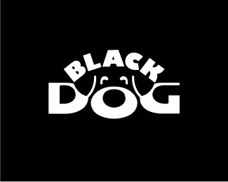
Description:
Trade mark of car care products (v.1)
Status:
Client work
Viewed:
41065
Tags:
black
•
negative space
•
minimalism
•
dog
Share:


Lets Discuss
Awesome mark!
Replythis would make a great white vinyl transfer sticker to be put on windows and such. best of the bunch design wise and for the industry in my opinion.
ReplyVery clever integration with zero sacrifice of legibility.
ReplyThanks, I'm glad to hear it.
Replyvery clever and cute :)
ReplyI wish I had done this. It's amazing.
ReplyWow, great use of negative space! I too am shocked at the %22zero sacrifice of legibility%22 as logoboom pointed out. Not to mention, the dog is just as legible. Nothing looks forced. Great job.
Replyvery cool - ditto to Oc.
ReplyWoof Woof, nice work.
Replyyeah %5Editto again.
ReplyThe dog's b*****ks. Nice one.
ReplyDitto x 10
ReplySPASIBO!
Replyahhhh ditto. So brilliant. this is really refreshing!!!
ReplyThanks again. I'm very glad.
ReplySimply amazing!
ReplyWoof..in awesome:)
Replysuper!
ReplyThis is great - ditto to the good comments on using the negative space. Love it : )
ReplyThank you all. I'm verrry glad.
Replyreally good one
ReplyThank you, andreiu.
Replyvery very good!
ReplySpasibo, Nikita.
ReplyVery very good! It took me a couple of secs to realise the ears.
Replygreat use of space :)
Replyinstant classic
Replycongrats :D
ReplyI particularly like the shape of the letter o. Very nicely done.
ReplyWouldnt be bad as a dog food brand!
ReplyVery, very, very nice! It is good for memorising. Despite the black color looks very friendly.
Replyvery creative. :)
Replyme gusta!*esta muy chido
ReplyMany thanks!
Replyinstant fav!
ReplyGreat use of the negative space. Nicely done.
Replycan't believe i missed this one. great work!
ReplyGreat integration of a dog face without effecting the legibility or the wording, big kudos to Carlove
Replygav)
ReplyPlease login/signup to make a comment, registration is easy