Float
(Floaters:
16 )
Description:
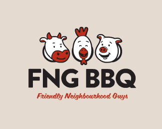
WIP logo design for a barbecue team.
Status:
Work in progress
Viewed:
4848
Share:


Lets Discuss
i always enjoy seeing your work. one suggestion, i don't think the bottom cross mark of the spatula and fork relate to the mark as a whole. it might be too contrasting in sizes.
ReplyThanks man! Cheers for the feedback, scrapped the spatula and fork. :)
Reply...and for that, a float from me! actually i just forgot to float it last time. nice, i think it's more balanced now.
ReplyNothing to do with your design, moreso the company name, but I read it as F'ing BBQ! (effing bbq). I'm just an idiot, though. **Also, it looks like those guys are up to something. The pig farted, the chicken thinks it's funny, and the cow is in the middle of realizing he's in a logo for bbq.
Replyi literally just pissed myself laughing. nathan, thank you for making my day.
Replyi'm sorry for ruining a pair of your pants.
ReplyHahaha! :D**Yeah I completely agree Nathan, not quite sure if it's done on purpose or not to be honest!
ReplyJust scaled the tag line up to match the size of the name, much happier with that now.
ReplyThanks for the awesome feedback David - I see what you mean! The shapes you drew really help to highlight it too, and from looking at the two together like that my eyes are drawn much more to the lower one and just seem to read it better. The upper one seems to have a real awkward/abruptness about it...**Updated. :)
ReplyCheers y'all for the floats too!
Replyi read effing too! nice job!
ReplyPlease login/signup to make a comment, registration is easy