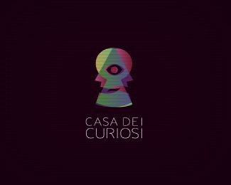
Description:
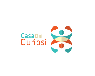
"The house of curious people", In italy is "Casa dei Curiosi". Its a acting courses house based in Italy. I hope the concept is pretty clear.
Status:
Work in progress
Viewed:
4294
Share:

Lets Discuss
Please feedback, guys. :)
Replyi really like the mark. very interesting. i think the type could use a little love. a little too abstract. maybe contrast the abstract icon with a %22curious%22 sans serif.
ReplyAgree, very interesting mark, Breno. The visual fits the name well. I actually like the type, but wondering if there might be a little less air between the letters.
ReplyThanks Colin, I've tried, looks really nick with a thin sans font. I will show both options for the client.
Replyahh...forgot to float this. there ya go!
ReplyThanks Sean!, I'm working on this type, thanks for your thoughs, mate. Will update in few minutes. :)
Replygood:)
ReplyThanks 1ta. :)
ReplyColor and kerning updated. We need critiques here! :P
Replyok, i'm starting to like the type the more i look at it.
ReplyInteresting, I see a pyramid and an all seeing eye in there. I like the font but maybe a little thicker?
ReplyHehe Thanks guys! bed time, tomorrow I'll work more on this. Thanks again :)
ReplySeeing the preview, I was pretty certain this was done with the input of James Strange (which is not the worst thing one can say about a logo, is it?). %0D*%22I see a pyramid and an all seeing eye in there%22 - Same for me, especially with %22dei%22 appearing in the name, but it might sound perfectly normal to Italian ears.%0D*In my opinion, the mark is strong enough on its own, so you don't need camel case for the type, two different lower case %22i%22s or mirror the S to shape an R.
ReplyThanks a lot Barry, I will consider every word. The piramid issue, I thinks is only for people who is accustomed to working with dollars :D
ReplyColor updated! :)
ReplyPlease login/signup to make a comment, registration is easy