Description:
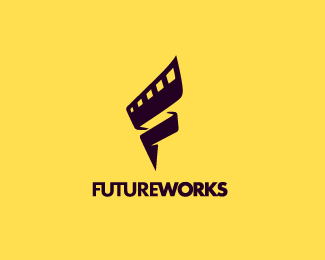
Logodesign for company based on India who provides media post production services to comercial and feature films, visual effects, etc. I'm not really sure about colors, and thats the message is clear. Thanks for the critiques. :)
Status:
Work in progress
Viewed:
27598
Share:
Lets Discuss
awesome stuff, Breno:)
ReplyThanks Claudiu :)
ReplyYep, this rocks Breno:)
ReplyI really like the concept .. just one issue *with the futureworks the symbol is very clear but *with out text it looks like 'S' in a go.*try make the bottom edge a bit straighten.. i think it will work, just thought.. totally up to u :)
Reply%5E Niiiicee! Thanks guys! :D
Replysaw that %22s%22 too, but kudos dude, nicely done :)
ReplyThanks guys, but i cant solve this issue :/
Replylooking good Breno. nice piece. %3D)
ReplyGreat design Breno! It look like an easy fix. Can I ask why you can't solve the S issue.
ReplySo i think that i dont understand :/ - Please help me guys :)
ReplyUpdated. Thanks everyone :)
ReplyThat's so much nicer :) good job
ReplyThanks, Thomas! really means a lot for me, buddy :)
Replycongrats :)
Replylooks very nice:)
Replygood graphic idea!
Replysimply cool Breno!
ReplyThanks everyone! :)
ReplyI dig it. I'd wear that Tshirt.
ReplyStill looks like an S to me, mate. Do you really need that middle part in the back? I think you can still convey folding, keep the same motion feel and have a nice F without it, hm? Just a thought..
ReplyThanks Wize. Take a look on this update, i think its no a S no more. :)
Replylooks awesome, man.
Reply%5E agree. lookin' awesome.
ReplyWicked good BB.
Replykiller stuff buddy .....
ReplyLove your work, man. It also has sort of a lighting bolt feel...which totally makes sense. Keep it up!
ReplyStellar work my friend! :)
ReplyYes Kevin, Lighting bolt indeed. Thanks everyone!
ReplyReally cool, breno.
ReplyNot trying to sound off but seeing the co is calling themselves 'Future' works is using film the right way to go? *If they do use traditional film techniques then fine, but most post production is digital now. Your design doesn't say future to me, only the name does.
ReplyYes, it makes sense what you say, Electrocink.*I chose the film couse it is a more iconic representation of that industry. It's more assertive, in my opinion%3B nobody has doubts that this is the logo industry seeing a film.*Maybe if I use other newest media, was not so recognizable, and too get old as the film ... Anyway, I think this discussion has two faces.*Thanks for your imput! (and sorry by my english :D)
ReplyVery nice logo! I really love the idea of incorporating the filmstrip into the F.
Replyhttp://www.crowdspring.com/project/2291722_logo-design-for-new-on-line-eye-wear-company/entry/3260905_propuesta1/**either this is yours or this guy ripped you off %3B)
ReplyIn a contest that will pay %24 99 for the winning logo are you expecting what? he have to ripped it to be worth the work haha :)
ReplyGreat as always again!!
ReplyI realy like the mark...but not sure about the colors.*I think this colors combination remember constructions....*Maybe still the type color and change the mark color with a white bg.***Sorry about my bad english %3D/
ReplyNo problem, Hunter3d my english is bad as yours :D**Thanks for this suggestion, I will work on some new palettes, but I like this combo, the client drop out, so I will study on this a litle bit more soon. :)*
Replyhttp://frankly.fr/*This guy ripped off this really nice logo. Thought I would let you know.*Loving the color palette by the way.
ReplyGreat love it
ReplyWhat is the name of this type of font?
ReplyI love it btw :D
ReplyPlease login/signup to make a comment, registration is easy