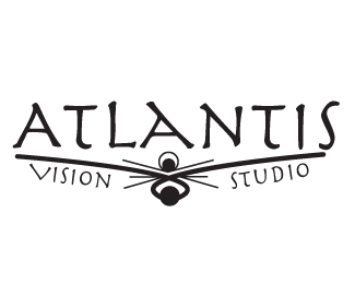
Atlantis Vision Studio
by BabbeyLynn • Uploaded: Jul. 22 '12

Float
(Floaters:
0 )
Description:
For my class i had to recreate the logo for this company.
Status:
Student work
Viewed:
859
Share:


Lets Discuss
I like this one a lot better than the other one. The name of the company is Atlantis Vision and this shows that in the logo. I am not to sure about the small lines and how they are going to be able to work well when it comes to have to cut it out. I like the font and how it goes with it. I really don't think it needs any color at all. The black and white works great and I love the white space that you have made with it.
Replythanks for your great feedback!
Replybrooke.i like the font, i like the illustartion. but i'm at a loss for knowing what this business is at a glance of this logo. i like the leading lines to the illustration in the middle. cheers.
ReplyPlease login/signup to make a comment, registration is easy