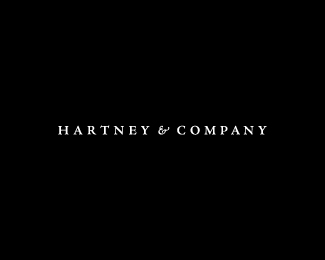
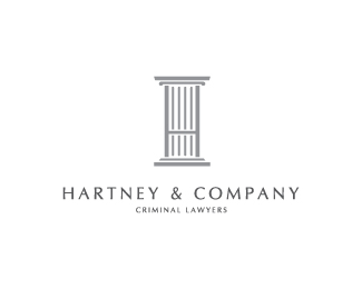
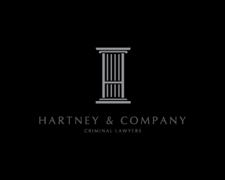
Hartney & Company
by Ayce • Uploaded: Nov. 29 '10

Float
(Floaters:
3 )
Description:
We started with the logo to determine our design vocabulary. Nathaniel wanted a strong, classic and sophisticated logo that had "no frill, no gimmicks." In the end, we designed a logo that has that classic feel utilizing both a serif typeface and an ampersand. The idea of keeping the logo black and white delivered that clean, strong, sophisticated, look.
As seen on:
Hartneyandcompany.com
Status:
Client work
Viewed:
3915
Share:

Lets Discuss
Please login/signup to make a comment, registration is easy