DR Automobiles logo restyling
by ApplexDesign • Uploaded: Sep. 13 '25


Float
(Floaters:
2 )
Description:
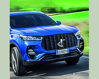
envisioned modernising the @drautomobiles logo by recreating the two letters “D” and “R” from todays logo into a single, more modern and dynamic symbol.
A crossroads, this is the concept behind the new pictogram.
.
Please.... let me know what you think in the comments.
.
Thanks
As seen on:
https://drautomobiles.com/
Status:
Work in progress
Viewed:
372
Tags:
logotypo
•
black
•
monogram
•
logorebranding
Share:


Lets Discuss
Please login/signup to make a comment, registration is easy