Description:
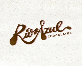
Hello everybody, This is another version of my Rio Azul logo, I never got to upload it. The text is supposed to look like flowing melting chocolate, or at least give a visual of that. Rio Azul was the name chosen for this brand because Rio Azul, Guatemala is where they found the earliest traces of chocolate.
Status:
Student work
Viewed:
5142
Share:


Lets Discuss
very intersting type work
ReplyThanks! type and signs, Ill take it as a compliment.
Replyyep man .... compliment is exactly what I tried to express ... :D
ReplyCool! Thanks!
Replygreat typo
ReplyThank you peg!
Replytasty Rio)
Replyi like this type
ReplyPlease login/signup to make a comment, registration is easy