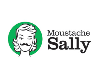
Description:
We always love it when clients come to us with a logo project with a great name and give us free reign. Such was the case with Moustache Sally, a website and blog that will feature humor and videos. Even though we loved the name, we knew it wouldn’t be easy to capture the particular feel that the client was looking for. In the end, we think we were able to express it with a wink and a little whimsical illustration.
Status:
Client work
Viewed:
7201
Share:
Lets Discuss
made my day
Replyman i love this!
ReplyBrought a smile to my face : )
ReplyLike it, but for some reason the green backdrop is bugging me.
Replywow, beauty with mustache ... (Moustache)
Replyha ha that's creat! How lucky you were to receive this job. The mustache is perfect!
ReplyLadyBoy)))**Girl with Moustache
ReplyBingo! You nailed this.
Replyfabulous!
Replyreminds me of bioshock%5Bthe game%5D splicers, if you know them. :D%0D*great and funny concept! :D
Reply@andreiu - she needs a pipe or a gun, then she's perfect for bioshock! :P
ReplyThis is GREAT! Lucky duck! However i do think that Moustache %26 Sally should be centre aligned. Their widths are too close to be left aligned. Fantastic illustration.
Reply@gyui - and maybe walking on the ceiling with her head bent! :))
ReplyThanks for the kind words guys. Much appreciated. It was a fun job for us to work on.**@hindmarshdesign: normally, we would agree that it the type should be the same width or centered. This was an odd case though, as making them the same width causes the %22Moustache%22 type to visually appear longer, due to the 'y' in %22Sally%22 extending so far. It's a subjective thing, I suppose.
ReplyVery very cool. I want this on a t-shirt!
Reply:)*it's very cool!*i would be happy with a same name :)
ReplyGreat! Really cool but I would have found an M that looked a little like a Moustache - dropped it on her face then worked the logo type out of that typeface.
ReplyPlease login/signup to make a comment, registration is easy