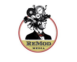
Description:
ReMod Media is a production company focusing on online TV content and the like. The concept for the logo was to create a character who was quirky, yet sophisticated with a nod to history. We had a lot of fun fusing together the helmet of bizarre contraptions. The ReMod’ers are so fond of him, they lovingly named him “Barneby.” He’s eccentric, yet enlightened and always keeps it real with his red bow-tie.
Status:
Client work
Viewed:
11270
Share:
Lets Discuss
This logo has huge brand potential. Very unique and memorable.
ReplyReally good
ReplyAwesome collage :)
ReplyAnother timeless gem.
ReplyI agree with Ocular. Huge potential, nice form, very memorable. I think you could tweak it a bit to make it print/scale better. I can totally see this letterpressed on some really beautiful paper. http://crankypressman.com does some great original letterpress prints at an affordable cost. all the best.
ReplyThis is totally awesome. I agree with Ocular and tconrad. There's really a big potential in this one. Unique, nuff said.
ReplyI love this. Nice job. Really fun.
ReplyNice concept. Nice execution. I'd say you've got a winner.
Replythat looks like a vintage logo, good work, i love it!
ReplyVery original design. Real showstopper.
ReplyReally appreciate the feedback. Jobs like this don't come along too often.**They put it in motion on their website, which was really awesome to see.
ReplytHis loG0 needs w0rKing, maRketinG manAgeR shouLd carRy oN iT...%0D*realLy beAutiFull
Replyexcellent illustration
Replytotally awesome.**Although I wouldn't want to be the printer trying to get that thing to reproduce on a business card.**Very memorable none-the-less.
ReplyGlad to hear it's memorable!
ReplyPlease login/signup to make a comment, registration is easy