Description:
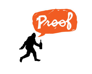
“We’re not sure what kind of imagery we want, but we know it should be unexpected and fun.” We couldn’t have been more enthusiastic to hear that from the founders of Proof Wine Marketing. The final design solution makes use of a rotating logo family that is comprised of 3 different characters, each with its own corresponding color. Big Foot, Nessy and a flying saucer will leave conspiracy theorists searching for “Proof.”
As seen on:
Status:
Client work
Viewed:
4667
Share:


Lets Discuss
i like the speech bubble and the type but what is with the drunk guy and beer bottle in his hand? Big foot or big drunk?
ReplyI think I get it. That's big foot holding a wine bottle, right? I like this one.
Replyyes it%60s unexpected and fun. bravo!
ReplyYes, it is Bigfoot. The identity is actually a system, with three different logos. One is Bigfoot, but there is also the Loch Ness monster and a flying saucer. Check the rest out here: http://alphabetarm.com/logos/proof/
Replyhey alphabet arm, i saw the other logos, and i think they're pretty cool. for the UFO one, it would be neat if the UFO was beaming up the bottle. the bottle in the bigfoot and loch ness ones make sense, but the UFO bottle location is not quite there. The loch ness one is really well done IMO. nice job! :)
ReplyHa! Nice!
Reply:)) ha-ha-ha
ReplyThanks all! We get a smile out of it too.
Replyhaha great, you can work on the bigfoot a bit more though (imo). My first impression was a human.
Reply)))))*Cool!
ReplyYes! finally this masterpiece in the gallery:)
ReplyGalleries should be filled with design that is fun!
ReplyI see BF immediately, great job, cool concept, fresh approach.
ReplyUnless I would have read your explanation, I would have not gotten Bigfoot out of that. The idea of %22Proof%22 also does not really work without an explanation. I think this was certainly unexpected and fun, but I think it misses the mark in conveying the message which should be the main goal.
ReplyFun logo. Nice to have clients willing to take chances - that's rare these days.
ReplyUnless a someone was born yesterday and their not familiar with the famous picture of bigfoot then they wouldn't get it. But that silhouette definitely represents bigfoot to me. Good job on all three of them.
ReplyAwesome concept mate, very well thought out.
ReplyI didn%B4t see a Big Foot until I read you :(*But it%B4s a fun and good concept.
ReplyPlease explain to me for select criteria logo in the gallery. :%7C
ReplyI've seen this before and thought it was great, but I definately didn't see Bigfoot (and I am well aware of him) - nor did I see it before I read the description.**What I seen was a drunken hooded homeless man carrying a wine bottle with the word %22Proof%22 reflecting the Alcohol Proof %25 of the drink.
ReplyVery clever. Love it.
Replylooks good
Replythat big foot image is iconic...
Reply@nido Yes, the Bigfoot image is iconic, but with the addition of the bottle of the wording, it changes the overall composition. As you can see, there were many others who know what the Bigfoot image is, but did not recognize it in this format.
Reply@jedah... :) I was referring to those that said they did not see/recognise bigfoot...
ReplyThanks for all the thoughtful feedback. It's always cool to hear opinions about our work.
ReplyThe photograph is iconic. A sillohette of the photograph - not so much.
ReplyPlease login/signup to make a comment, registration is easy