Restaurant rating
by Alisa1711 • Uploaded: Nov. 10 '10 - Gallerized: Nov. '10

Float
(Floaters:
73 )
Description:
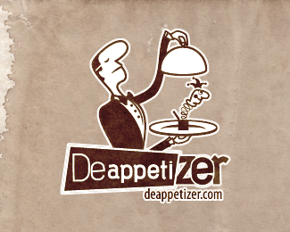
Logo for free consulting service "St. Petersburg Restaurants Rating" which provides information about Bars, Café, Restaurant etc.
As seen on:
my portfolio on revision.ru
Status:
Unused proposal
Viewed:
13718
Share:

Lets Discuss
It's nice. The only thing I don't like is the second word being bigger. Also the bottle in the middle looks like a log because of the color, IMO.*
Reply%5E Really? Type looks good and second line does not bother me. Though I'm agreeing on the middle color. Overall it a cool logotype.
ReplyReally-really :D Type is fine, just a thought about one size.
Replygr8 feel...dig it
ReplyOchen' nravicco!:)
Reply2Nikita: Yeah, maybe you right about middle bottle's color (:*2Kot Bazilio: It's became boring on Free-lance without you. I enjoyed reading your intelligent conversations with Alexei Tern. O, common! Came back! (-:**2All: By the way, here's some ideas about using the logo in visual identity http://www.free-lance.ru/users/Alisa1711/viewproj.php?prjid%3D2329805
ReplyIt has that old tavern feel.
Replylove everything about it, but i have one comment if i may..did you try coloring the typeface with the same color of the outlines? IMHO, it could be nicer :). but over all I dig it really great job there Alisa. CHEERS*
Reply2mavric*Yeah, I think that you're right. Thanks.
Replygood feeling...* *
ReplyOchen' krasivo :)
ReplyI like the look %26 feel and coloring, the brown doesn't bother me. I don't think of a log because the pink and red have the same form. Personally I like bright colors and think green instead of brown in the middle wouldn't look to bad either. Just a thought :-)
Replygreat!
ReplyNice work.
ReplyPlease login/signup to make a comment, registration is easy