Description:
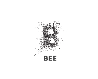
A swarm of bees forming a "B"
The companies real name, is not "Bee" but is quite similar.
I will upload with real name when possible.
As seen on:
alexanderspliid.com
Status:
Nothing set
Viewed:
43408
Share:





Lets Discuss
originaly nice %3D)
ReplyThank you ideoma :)
ReplyGreat work Alex!
ReplyThanks alot guys, I appreciate it. If anyone has ideas on how to improve it, i would love to hear :)
Replygenius!
Replygood one alex
ReplyThank you flo and dreikelvin, means alot!
Replyyea. very good
ReplyVery cool...I can almost hear them!
ReplyThank you. Glad you liked it :) *Not a very pleasent sound, if they are comming for you i guess. *
Replywaooo, good Idea, congrat.. alex , ! gallery for sure
Replycould also bee antz %3D)
ReplyNice! :)
ReplyThank you, it's overwhelming, commin' from you guys %3B)**@ Alex - I would be honored to see it on BS with that title!*@ Rincon, Thats not for me or you to decide, but it would be great :)
Replygreat :%3E
ReplyThank you magicshadow.
Replygood job man ..it works very well
ReplyThis is H-O-T!
ReplyAwesome with a capital A!
ReplyThank you so much guys!
Replyahhaa nicee
ReplyGreat!
Replyme likes :)
Replyvery nice. all this dots are real bees or just dots?
ReplyThanks for the gallery spot David! And thanks for all the floats and kind comments, means alot when commin from such talented designers :)**@ ask. It is dots, which are warped into lookin like simplistic bees.*I didn't wan't %22real%22 bees, which could look clumsy at some sizes, But neither did i want %22just%22 dots, which would look poor when scaled up. **
ReplyWell all B.
ReplySorry to be the one but the execution is close to http://logopond.com/gallery/detail/62856
ReplyThank you for the heads-up dbunk... There are similarities and differences for certain. Will evaluate on that. Thank you.
Reply%5E I don't see any problem.
ReplyGreat work! Yep..no prob IMO too. Not sure about printing of this mark though but it is very neat..the bees can almost be heard :)
Reply%5EYou're safe I reckon. Lovely mark.
Replylove it. but i really don't like the type here
ReplyBeeaut.
Reply@ ocularink - Thank you. Always good with a second opinion. I am not seeing a huge problem either and i guess some color and the rest of the identity, would make the difference even bigger. **Thank you terry, cseven, phane and firebrand :)*
Replyvery good
ReplyPerfect!
Replyo i like this a lot!
Replyamazing bee
Replysince you asked for feedback, it might look interesting if you added a single yellow bee to the logo somehow. I think that the splash of color would make it more distinctive.**Regardless, you have done a great job on this.
ReplyLove this!
ReplyThank you garavi, destroyer, elisteli, logotistical, rambal, heinzelman and danistorlie. Appreciate it :)**@ Heinzelman - adding a single yellow bee wouldn't do any good imo. It would barely be visible. The colorscheme really adds something. Will upload in color, with real name asap.
ReplyI agree but one could bee the Queen bee :)
ReplyI absolutely love this, I wouldn't change a thing.
ReplyVery nice! Solid showcase yourself, appreciate the comment, man!
Replythis is awesome but typography
ReplyThanks guys. I'm btw happy to announce that theese little fellas' has found a new home and a happy owner.
ReplyBrilliant!
ReplySuper cool %3D)
Replyvery nice!!!
Reply%5E thanks a lot guys. *Btw. Just got my copy of Los Logos Compas. What an delightful book, I am truly happy that this logo is featured next to all the other talented Logoponders who have their works included in the book! I've learned tons of stuff on here, so thank you David and fellow ponders for being awesome!
ReplyCongrats. Great logo.
Replygreat execution.. as if i can hear the droning...
ReplyGreatttt
ReplyVery cool!
ReplyA great idea!
ReplyGreat logo
ReplyPlease login/signup to make a comment, registration is easy