Description:
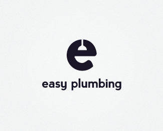
Logo concept for easy plumbing.
Update: Made 'bottom' look more like to toilet bowl.
Status:
Nothing set
Viewed:
4419
Share:


Lets Discuss
Has anyone seen anything like this out there?
ReplySeen a lot of 'e' marks, but never something like this. Real nice Fred :)
Replynice idea! you could shape the bottom part like a toilet bowl
Reply%5EI think it is already...
Replyhttp://www.daveburdon.com/%23208946/Enlighten
ReplyThanks a lot gentlemen! The bottom is definitely intended to be shaped like a toilet.
Reply@Nikita, similar looking e for sure, but for a lighting company.
ReplyAny recommendations for making the bottom look more like a toilet?
Replyhehehe... you said %22bottom%22...
ReplyGreat concept! I think a bit more detail around the plunger and toilet might bring those objects into it more. Maybe a rim or slight ridge around the edge of the bowl?
Reply@ Nido - LoL!*@ Lumavine - great suggestion
ReplyUpdated - thanks @lumavine for the suggestion. Getting close.*
ReplyThanks harris!
ReplyNice mark!
ReplyThank you, Miroslav!
ReplyNice one!
ReplyPlease login/signup to make a comment, registration is easy