Description:
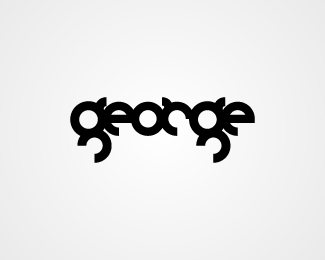
Logo designed for a small architecture firm. The client wanted a custom, clean bold rounded font as the logo.
Status:
Nothing set
Viewed:
2058
Share:
Lets Discuss
as you can see the %22ies%22 blend with each other. Try fixing it
Replyfixed!
ReplyPlease login/signup to make a comment, registration is easy