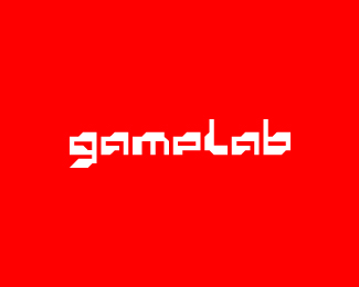
Float
(Floaters:
44 )
Description:
Custom font work for a game studio.
Status:
Work in progress
Viewed:
6093
Share:

Lets Discuss
updated.
Replyinteresting.
Replythanks. bit of a homage to the past, but also trying to keep it modern.
ReplyGreat stuff, I like this a lot!
Replydiggin it!
ReplyThanks guys for the feedback.
ReplyNice custom font!
Replywow! thank you, did not expect this to be gallery worthy.
ReplyGreat great design its having a classical game feelings typography%5E%5E
ReplyCool. Reminds me of vintages games, space invader feel.
ReplyVery good! :)
Replylooking good. and it has the right feeling!
Replyyeah baby!
Replyawesome..*
Replycool lettering!
ReplyNice lettering! It feels very original but still fits into a specific time and place. The e is almost too p like. Maybe if the very bottom could have a diagonal cut like this %5C on the right side, almost like the g has at the bottom?
Replyoops it took out my backslash diagram.
Replynot ordinary type)
ReplyThanks for the comments! **@ lumavine. I tried the 'e' with a diagonal bottom, but it didn't suit in my opinion and found the solution i have suited better the to overall structure.
Replygreat feeling. i like this.
ReplyInteresting solution...I like.
Replycheers guys!
Replystylin!
Replythanks dude.*
ReplyPlease login/signup to make a comment, registration is easy