Description:
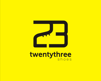
This logo consists of a combination of numbers 2 and 3. And in which there are shoes.
Status:
Nothing set
Viewed:
4610
Share:


Lets Discuss
Very clever mark!*I think it would look better if you use much smaller font size and place the whole brand name below in same width as mark (like this: http://logopond.com/gallery/detail/158707)*Good luck!
ReplyThank you for the advice, balic.*updated!**:)
ReplyThis looks much better to me now, I see the shoe at first glance.*Cheers!
ReplyPlease login/signup to make a comment, registration is easy