Float
(Floaters:
3 )
Description:
Proposal for property development & investment company.
Status:
Nothing set
Viewed:
2292
Share:


Lets Discuss
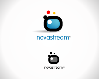
reminds me of Raja's boxbound, but I like this mark too. If I were going to embroider this on a golf shirt, would it work?
ReplyI see now that logos are similar. Although my piece has weaker typography...*And no, it wouldn't work embroided on t-shirt, but it does convert pretty well to greyscale.
ReplyI wouldn't say your type is weaker. It's more corporate.
Replygreat colors.**That's also my favorite free font as of late. Which is great, but note that it might start getting overused soon...which probably isn't a huge issue for a property development firm.
ReplyPlease login/signup to make a comment, registration is easy