Float
(Floaters:
2 )
Description:
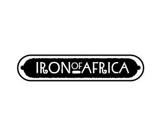
Copany that manufactures wrought iron furniture
Status:
Nothing set
Viewed:
1543
Share:



Lets Discuss
the bar below %22of%22 seems a little heavy to me.
ReplyGreat logo, but watch the negative space. You're trapping a lot of empty space on either side of the logotype. It makes it feel a bit unbalanced
ReplyPlease login/signup to make a comment, registration is easy