Description:
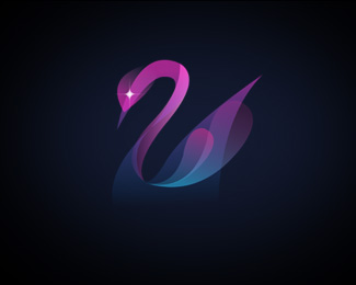
Logo for woman owned web design studio.
As seen on:
egopop®
Status:
Client work
Viewed:
17528
Share:

Lets Discuss
brilliant..like this very much*should be add to gallery !!
Replybeautyfull
ReplyReally nice colours,very interesting how it looks on white background...
ReplyI just love this version.
Replystunning.
ReplyA beaut.
Replythis one looks very nice! coloring is beautiful.
Replybeautiful colours and blending!congrats
ReplyTruly beautiful!
ReplySaw that beauty before, still nice.
ReplyVery nice mark - would love to see this in identity use!
ReplyThis is really cool looking. Sweeeeeet!
ReplyYou handled those gradients exceptionally well.
Replylove peace and harmony
ReplyVerrry nice colours and blends. It would be interesting to see how you'd translate that logo to a white background and a monochrome version? **Also, kind of an obvious question: but why is the swan not facing the other way so that you have the %22S%22 shape readable in the neck?
ReplyStunning!
Reply%5E%5E The version on white background is already in the gallery, fyi. :)
ReplySeen this around %3E love it!
ReplyBeautiful
Replytruly amazing!!
ReplyStill in love with this.
ReplyWhat a awesome use of gradients %26 transparency. Great job!
ReplyGreat! This is like an oasis of calm, lotus on the lake in the land of serenity...
ReplyPlease login/signup to make a comment, registration is easy