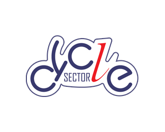
cycle sector 1
by vld • Uploaded: Nov. 03 '07 - Gallerized: Nov. '07

Float
(Floaters:
31 )
Description:
Logo for Cycle Sector, they manufacture and sell motorcycle parts and accessories.
Status:
Unused proposal
Viewed:
9364
Share:


Lets Discuss
I like this one most. But maybe you could change the pink into orange, red, blue or green. Pink isn't attractive to your target group.
ReplyI saw a motorcycle but I didn't read %22cycle%22 because od the reflected C.
ReplyI agree with Beklad - This is the best out of the Cycle Sector logos. I also agree that a red or maybe even a rich yellow would work better. Pink, to me, suggests you sell mopeds/scooters. **Overall an excellent use of type. Well done!
ReplyNICE!!! WOW!
ReplyVery nice. However, I think where it works as an illustration, it doesn't necessarily work as a logo (too complex and hard to read I think).
Replyyeah it took me a bit to read cycle, but i didn't care once i realized it forms an actual motor cycle. same with the sector. didn't like it until i realized it is supposed to be exhaust. pink just does not work here. i don't know many who ride pink bikes.
Reply@ Climax - LOL!! Good one!**I think the logo can be tweaked some more to be perfect, but the idea is great. I agree with Climax. It could work well. :-D
ReplyTnx guys.%0D*I'm sure it needs some tweaking, especially the %22smoke%22. Letter %22t%22 do not fit well and overall thickness of the letters is not good.%0D*I tried to stick to original helvetica style on the motorcycle as much as I could.%0D*%0D*And now, PINK!%0D*From the beginning I knew that this is not the style client is looking for so i didn't badger to please them. I just had to do it this way. I now it's somehow odd to make it pink but I like how it looks.%0D*I'll upload a modified version soon.%0D*%0D*@ Climax: I'm speechless! LOL%0D*
ReplyLol. Having seen Climax's comp, I'm sold. Works really well.
ReplyI think the shop door should be on the right!
ReplyI saw the words cycle and the bike straight away. *...Brilliant *
ReplyTnx for the comments.%0D*I made some changes, on color and word %22sector%22.%0D*
ReplyWOW
ReplyI think the cycle works so well on its own that sector is taking away from it. When something is that standout, you want to compliment it, not compete with it. I get the whole smoke thing, but... that's also an indicator of an engine problem %3B) I'd find a nice, clean typeface and place %22sector%22 on the bottom.
Replytnx vr4jen. Interesting opinion, specially this part about engine problem. I never thought of it...
ReplyI love the %22cycle%22 part but not the sector!
ReplyThanks Jess...%0D*I must say that I still like it as it is :) although some people told me that the smoke from the exhaust is not a good sign :)
ReplyThank you kral oyun!
ReplyPlease login/signup to make a comment, registration is easy