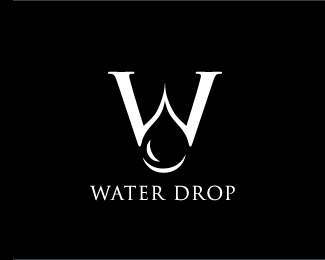
Description:
Logo design for a waterproofing company – Waterproof Structures LTD., New Zealand.
As seen on:
http://petervasvari.com
Status:
Client work
Viewed:
20024
Share:
Lets Discuss
Wow. This is fabulous! A superb use of negative space. Type is a perfect fit. Very nice execution on this%3B concept is great, graphics are great.
Reply%5E haha
Reply*cry* ...ugh, W. Too bad this logo has to suffer because of him...
ReplyFabulous mark! And I disagree that it looks like Bush logo... okay, its a 'W' too, but it has no similarity with this mark at all.*
ReplyGentleone! Thank you ever so much! %3B)
ReplyBingo, like it. Forget that W The President sticker. I always hated it. Gives me an idea.
ReplyOk and thank you j-CAZ! ...and I like it your negative logo %3B)
ReplyThanks JF your comments!
Replylove it, it is very original and unique
ReplyWho's that bush person ? Some sort of native Australian or something ?
ReplyRincon thank you nice saids! Thank you for the additional collaboration...
ReplyThis one is famous for a reason!*One of my favourite logos.*Excellent!
ReplyI am really glad about this, thank you Luka!
ReplyHi. I like your ideas. I need to have a logo and an icon for an android application. can you send me an email ?
Replymajid.yaghoubi@live.com
Please login/signup to make a comment, registration is easy