Description:
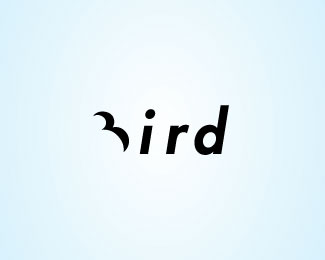
I'm bird...a little bit.
As seen on:
http://petervasvari.com
Status:
Just for fun
Viewed:
17492
Share:


Lets Discuss
wonderfully clever!
ReplyWow, that's well done. Reads easily.
ReplyThanks logofairy and !mude!
Reply...mude :)
ReplyReally nice.
Replythis is cool!
ReplyYeh nice job here
ReplyGood show
ReplyYup, great concept!
ReplyHuuu :) Thanks for the comments epsilon, lboi, cerise, lundeja and siah-design!*I am fine! :)
Replyoh, thats a nice one.
ReplyThank you very-very much milou!
ReplyVery clever indeed!! :)
ReplyThank you ever so much michaelspitz! Im flaying :)
ReplyBravo!!!
ReplyExcellent!
ReplyOh, thanks icu and Rokac!
ReplyAwesome idea, but the execution is not all there. Try not italicizing the type.
ReplyThank you momentummagazine! It is the flying bird through italicizing the type. And the motion through.
Replygreat idea
ReplyHey*http://logopond.com/gallery/detail/61350
ReplyThank you alterego :)
ReplyThanks dbunk! Nice your work! But, I hope so, another sort of and is decided difference.
Replyclever concept.
ReplyThank you rabbit_hoang! Im flicker :)
ReplyThat's cool!
ReplyThanks-thanks Brandsimplicity!
ReplySuperb. cool idea.
ReplyDear razen! Thousand thanks! I like my bird :)
ReplyThat's a good idea!
ReplyFlying logo - I see that it fly!
ReplyI'm flying...
ReplyYou're amazing bird)
ReplyI love such solutions :)
ReplyI love it too ... %3BD
ReplyThanks, I also really love it :)
ReplyPlease login/signup to make a comment, registration is easy