zapphire
by urbansicc • Uploaded: Nov. 17 '09

Float
(Floaters:
18 )
Description:
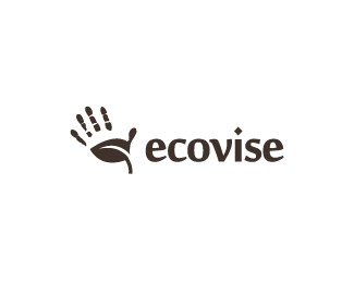
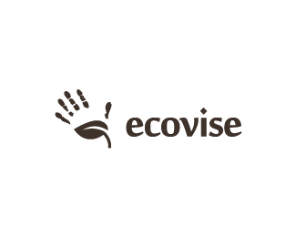
logo design for jewellery shop selling natural ecoproducts /with updated font/
Status:
Nothing set
Viewed:
5567
Share:


Lets Discuss
Looks nice. The only tweak I would consider is closing in the gaps from your open stems on your letters just a tad. The p's and h feel just a hair too open. If you squint you can see those three letters stand out more than the others. Also, try a version with the bar on the A there instead of absent and compare the two. Good luck!
Replythats a fantastic mark...
Replyinstant classic.
ReplyPlease login/signup to make a comment, registration is easy