Description:
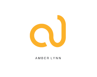
This is a logo of a fictional company. My teacher gave us several companies to create a logo for and Amber Lynn Clothing was the one I was most interested in. I tried to keep it extremely simple and almost abstract. The color is supposed to be amber. I had some trouble finding a amber color but I think it came out nice. It definitely needed the type on the bottom. I'm not sure if you can tell it is a clothing store, I'll have to refine it. Maybe add "Clothing" to the black type.
Status:
Student work
Viewed:
1820
Share:

Lets Discuss
I like this a lot! At first I thought I am seeing a %222%22, rotated 90deg to the counterclockwise. But now, reading that Amber Lynn is in the clothing business-I see a hanger! Cool stuff. *Amber to me is a bit darker, more towards orange, but that's just my feeling.*I would put the name in a slightly larger font size. To me it's too tiny compared to the mark.*Nice job!
ReplyI think that your logo turned out really good! it is abtract. even though you were going for a different color i think that it fits. and I think that you should move the name Amber Lynn up closer to the logo.
ReplyPlease login/signup to make a comment, registration is easy