Description:
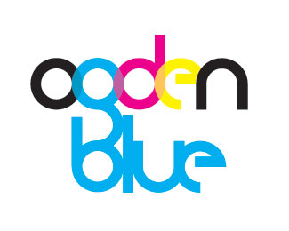
Logo design for Ogden Blue, a art supplies store. They also do logos and graphics so this was tough to do a logo for them, and I don't think they will use it. But, it was fun to do. This version is more colorful and done in CMYK. It is self-made typography. I also have one done with cyan and black.
Status:
Unused proposal
Viewed:
1868
Share:

Lets Discuss
I dig it! Nice job on the font %26 I really like the CMYK color theme %26 letting the colors bleed through is a nice affect.
ReplyThis is Great! I love the self-made font. I had to do that too. I like how the letters are transparent. It definitely say Ogden Blue.
ReplyI agree with both Darin %26 Louie ... I like the transparency and the CMYK factor. I also like how the %22g%22 connects to the %22b%22 and I'm totally diggin' the %22e%22.
ReplyI like it in the CMYK just because it is a print shop as well as an art supply store. The font is really great, it's much more modern than what they've got now! It fits Ogden Blue perfectly in my opinion, awesome work!
ReplyYeah I totally agree the CMYK colors just stand out and the connection with the g to b is very well thought of. Great work
ReplyI love both of the ones you made, I think this one focus more on the type of business that they are with the cmyk. I like how you show the overlap of the letters in Ogden. The d seems to me like it's set behind everything, kinda throws me off. Honestly the more I look at it, the more unsure I get about the g...I can't quite put my finger on it, but something seems off about it where it combines with the Blue...maybe if Blue were a darker shade so that it had the same effect of Ogden. I don't know if any of that made since or not lol
ReplyPlease login/signup to make a comment, registration is easy