Ulrich Design
by tulrich • Uploaded: Nov. 14 '09

Float
(Floaters:
9 )
Description:
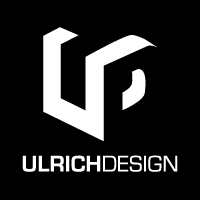
I made this logo for my graphic design business. Initials UD for "Ulrich Design". Logo made have a 3D effect with negative space being used to create the "D" part.
Any feedback is very welcome! :)
As seen on:
Status:
Client work
Viewed:
20778
Share:


Lets Discuss
By my standards, this is an instant winner (also in terms of possible longevity).
ReplyVery nice mark. Have you tried slightly rounding U's corners ? Straight angles look a bit forced.
ReplyI would like to see it black with a white background.
ReplyOh! I forgot to say, it' very good.
ReplyHas a similar look/feel to one of my logos.*http://logopond.com/gallery/detail/42304 **I like the symmetry of your logo and how it helps to visually divide the words %22ULRICH%22 and %22DESIGN%22. It'd be nice to see it in color - the black and white looks a bit too stark.**
Replymucho - very good
ReplyPlease login/signup to make a comment, registration is easy