Studio100
by sdijock • Uploaded: Oct. 16 '08 - Gallerized: Feb. '12
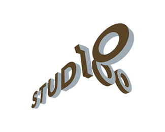
Description:
A logo designed as an internal branding project for my ad agency. The intent is to brand our internal production studio as a separate entity from our agency so we can bill out in-house services such as retouching and photo shoots to our clients. Unused proposal.
Status:
Unused proposal
Viewed:
17277
Share:



Lets Discuss
I like it ... just question, how it looks in BW? I would say good, too ...
ReplyHaven't tried it in BW yet, but I'm sure it'll hold up fine. Thanks janz.
ReplyThis is nice Steve. It's such a strong graphic but it needs to breathe a bit more. Could you possibly update it at about half its current size please?
ReplySure fogra. Good suggestion.
ReplyMuch better, thanks :)
ReplyMy pleasure. Thanks for the suggestion.
ReplyNice perspective bro., the 1 bugs me a little seems it needs squared up better but love how you made this work.
ReplyThanks logomotive. The 1 is actually picked up directly from the font family, but I agree with you and think the top of the 1 hangs out a little too much - it almost looks like a %227%22 now that i think about it.**I'll take another look at modifying it and repost. Thanks again.
ReplyAhhh, wait, I see what you're referring to now logomotive. I thought you were reacting to how far out the top of the 1 sticks out, but you were actually referring to the alignment of the 1. Not sure why it appears out of square to you but the alignment and perspective are definitely correct as it's something I painstakingly made sure of. The only thing that might make you think it's off is the spacial relationship between the 1 and the D and O. Even though the type was kerned correctly when flat (before I applied the perspective) the forced perspective makes it seem like there's too much space between them, which might make it appear visually out of square.
ReplyI missed this one. Cool perspective. Very nice Steve :)
ReplyThanks Jen.
Replywoohoo! nice
ReplyJust realized I had never floated this. I like it mucho.
ReplyThanks gentlemen.
ReplyI like the 3d look of it!
ReplyThanks mar!
Replyaaa me ganaste la idea, trabajaba con dos frases con el intento de fusionarlas de esa manera, pero tu resultado es muy muy bueno, a ni modo desechare esa propuesta, felicidades luce muy bien
Reply@mentelibre1 - Unfortunately, I don't speak Spanish, so I'm not exactly sure what you've said. I do recognize %22bueno%22 from the 2 years of Spanish I took in Jr. High, so I'm assuming you like the logo. If that's the case, then thank you (gracias amigo).
Replyi like your concept. not sure how it's going to work at a smaller size but it looks good.
ReplyThanks tass. The logo is pretty robust so I don't think it'll suffer at smaller sizes. Doesn't really matter though as they went with a different logo in the end.
Replyvery cool mark here! congrats!
ReplyThanks andreiu.
ReplyHave always really liked this one. Nice work!
ReplyThanks Joe. Means a lot coming from you. Much appreciated!
Replydon't know why I missed this. This is great!
ReplyThanks for the compliment Alex!
ReplyI appreciate all the recent floats. Thanks guys.
ReplyWow! your work is amazing. This is such an amazing piece
ReplyThanks Jarod.
ReplyStill one of my faves on here
Replyamazing ... yes it is !!
Reply%3D) amazing work!
ReplyWow! Thanks for feedback everyone! And thanks for the gallery placement David! Much appreciated.
Replyi'm just curious what will it looks in BW..will you make it? hehe very nice yet original
ReplyVery, very cool!
Replythis is strong but still simple..nice work!
Replymissed this one, great work here
ReplyCute vision!
Replynice work!!
Replyabout time!
Reply(@ logomotive), sdijock I think he means that the top of the one looks like it is not in perspective - the top should follow the vanishing point of the two zero's behind it (to the right of it) .. at the moment it looks like it follows the vanishing point to the left of the number 'one' :)
Replyps.. did you construct this as a true perspective, looks more like an isometric which has then been tweaked.. which may be the reason that the top of the one seems to 'droop' a little?
Reply@ logomotive... I think he means that the top of the one should follow the vanishing point the right (with the 2 zero's) - at the moment it looks like it follows a vanishing point somewhere to the left of the image*ps.. did you construct this as a true perspective, looks more like an isometric which has then been tweaked.. which may be the reason that the top of the one seems to 'droop' a little?
Replyoops - sorry for multiple posts still getting the hang of how posting works here and I have a cat!
ReplyNice work mate!
ReplyThe perspective for this logo was achieved through the aid of Adobe Illustrator's perspective tool, so it is technically accurate by the standards they've set in their program. It is, however, somewhat of a forced perspective to make the composition more dramatic and dynamic, so maybe that's what some of you are reacting to.
ReplyThanks Rune.
ReplyHi Steve, I think the perspective is perfect! maybe I did not explain my thoughts well enough. I think it's just the type you used here. See how the top of the 1 kinda has a slight curve and how the fron ot 1 (dark side)on same plane as Studio kinda sticks out at a different perspect than the front of Studio (dark side)? That was what I was talking about. Regardless it's really great.
Reply%5E Exactly. I think if the top of the '1' just came out perpendicularly to the vertical stroke it would be perfect. Awesome concept.
ReplyThanks again Mike. I really respect your opionion and appreciate your feedback.**Thank you too devey.
ReplyPlease login/signup to make a comment, registration is easy