Kenkel Design
by tomkenkel • Uploaded: Sep. 20 '11

Float
(Floaters:
4 )
Description:
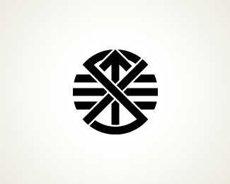
The logo mark is derived from a question mark and two single quote marks. It illustrates the essence of design—answering questions, solving problems, & questioning solutions. The type complements the mark, reinforcing the dichotomy of design with an implied line at 33°—a personal indulgence that helped determine the typeface.
As seen on:
Kenkel Design
Status:
Work in progress
Viewed:
2316
Share:
Lets Discuss
I actually think the type is quite strong by itself and would look better without the mark (although in my opinion the mark looks really nice in your avatar). I think the connection between the two words is really creative and well done.
ReplyDidn't read your comment at first, dtf, just looked at the logo and now seeing that I share your view about the avatar completely. Stick that sucker above the type and you have a winner. Nice work!
Replythought the same thing. i also think the word mark can stand on it's own. i'm not sure if the icon and type correlate here%3B however, i think they are both very interesting.
ReplyHey Tom, I agree with what the others have said. Both icon and type are interesting, but not together. The elements are too dissimilar, and they fight each other for dominance.**Personally, I would lean more toward developing a solid execution that favors the icon. It has a lot more meaningful concept behind it than does your slashed %26 combined type execution. And honestly, it's a lot more expressive and visually interesting. It looks great as your avatar, and I think pursuing that direction with the addition of simple, yet complimentary type would be the way to go.**Great work so far. I really like the thought that went into the creation of the icon. Interested to see how this develops.
ReplyInteresting..
ReplyThank you everyone for your comments. I was so excited this morning about the type concept, I hate to lose it but agree that it does not match the mark.
Replyloose the mark and work on type for that separately. keep the word mark here for now because it is very nice.
Replyi think you're fine. Don't drop the type, it's really nice. I think the flat circle version will match the type nicely actually. If not, try other shapes, but i see the circle working
ReplyThe LD monogram - the way you have it - is fairly common. I've seen at least two designers use it in their personal brandmarks. Also, see here - http://typophile.com/node/42497
ReplyPlease login/signup to make a comment, registration is easy