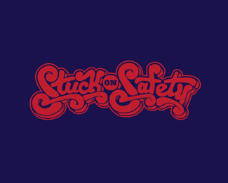
The Awakening Tour
by toddfooshee • Uploaded: Jul. 21 '11 - Gallerized: Jul. '11

Float
(Floaters:
35 )
Description:
Custom typography for tour posters/shirts.
Status:
Client work
Viewed:
4831
Share:

Lets Discuss
Amazing and inspiring!
Replyit's yes
ReplyHad a hard time reading it...
Replybeautiful design and detail. Legibility however is very very difficult.
Reply%5E beat me to it, ms
ReplyI believe the shading that I had added w/ some halftone style triangles is due to part of the legibility problem.**This also was created to never ever appear small, so that too also helped with legibility.
Reply%5ELet me rephrase that. When created, it was decided (more by client than myself) that it didn't ever NEED to be small in size.
ReplyAnd thanks for the comments!
Reply%5Eagree with the shading part. But for whatever reason I can read it much much easier when seeing it smaller. When it is larger like this, the lines spread apart more and it's a little harder to decipher. Don't get me wrong, it's a wonderful piece and is great for a band type execution! I would love to see a flat execution, though, with the background the same color as the stroke, so that it gives the letters a little separation
ReplyI see what you mean, I'll put up a flat version later on today. And thanks again Nathan for the comments. I greatly appreciate the feedback.
ReplyI think what would improve readability is to thicken the middle connection of the 'k' and bottom right horizontal of the 'w'. Something like the thickness of the top join of the 'n' seems appropriate. Still love this though!
ReplyWay hard to read %22Awakening%22. I had to look at the post name.
ReplyWoooww!! cool work man!
ReplySeems that the canvas wasn't big enough :P
Replyi love the whole style. it looks great to me!
Reply@lumavine: yeah, looking at it again I think that'll be something I experiment with.**and thanks everyone for the comments! really appreciate it.
ReplyHow in the world did you begin to make this design? Is it completely from scratch, or a modified typeface? Really gorgeous work.
ReplyI referenced a few different typography pieces from some designers to get my creative juices flowing in the beginning. But this was the product of about 30 hours worth of hand work. I sketched and sketched and erased and erased for what felt like weeks on this project. But I'm extremely happy with the outcome.*I really appreciate the compliment.
ReplyPlease login/signup to make a comment, registration is easy