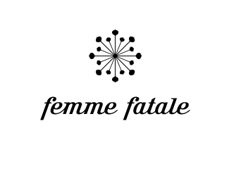
Femme Fatale
by thomas • Uploaded: Nov. 10 '07

Float
(Floaters:
3 )
Description:
Woman clothing & accessories boutique
Status:
Nothing set
Viewed:
3437
Share:


Lets Discuss
i think this is 'bottom heavy' thats not good for woman.. if you know what i mean... think you should start thicker at the top then 'curve' to slim maybe?... also the strokes in the 'F's are too straight %26 look a little rushed.. still got class though mate!.. %3B)
ReplyHey thomas, nice showcase mate. Just wondering about the 2 thin strokes on the effs on this one. Atm it looks kinda outta place. It doesn't have the nice subtle curves as the rest of the logo. Just a suggestion, what would it look like if you used the same little tail on the end of the effs in the inner part of the effs where the thin lines are, curling inwards. Really nice typeface chosen though. Cheers.
ReplyMany thanks Norman. Hope you're fine. That's a great suggestion about the 2 thin strokes. With Nido's comment, I think I could really improve this logo. What I try to achieve is a heart with 2 face-to-face f's (for femme fatale). That's why I first decided to cut the f's with a thin stroke, I was afraid they were not recognizable if I was %22playing%22 too much with it. I'm going to do some tests.
ReplyPlease login/signup to make a comment, registration is easy