Description:
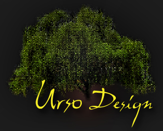
Based on some critiques.. this is direction I am now going.. looking for more input, thanks!
Status:
Work in progress
Viewed:
981
Share:


Lets Discuss
Would appreciate some input on this newest revision.. Thanks!
Replyok, you need to look around at other people's logos. no gradients for one thing. I think if Urso Design is the name, you should keep them the same font like with the tree. simplify, simplify, simplify. you are making it too difficult to start with. you can add effects later if that is your thing. is this designed in vector?
ReplyPlease login/signup to make a comment, registration is easy