Urso Design
by theurso • Uploaded: May. 11 '10

Float
(Floaters:
1 )
Description:
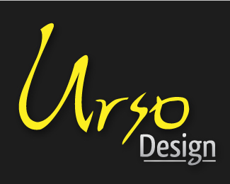
Current revision for personal logo..
Status:
Work in progress
Viewed:
1050
Share:


Lets Discuss
What is the purpose here?
Replypurpose of logo is for use on my currently being reconstructed site for my design company. Old logo is too aged.. So redesigning.. this is my current revision, wanted imput...
ReplyI think it’s a tree but it’s too intricate to be used as a logo. Reproduction would be a nightmare especially when reduced to the size of a postage stamp. Try simplifying and work with scale.
ReplyThanks @campfire for your input, it is a tree, ad I do agree detail is a big problem as far as resizing goes, its a work in progress..
ReplyI really like the lettering in 'Urso'..that alone says a lot and would look great as a logo**Remember this, a logo is complete not when you can't anything more, rather, when you can't take anything more away.
Reply* edited post**I really like the lettering in 'Urso'..that alone says a lot and would look great as a logo**Remember this, a logo is complete not when you can't ADD anything more, rather, when you can't take anything more away.
ReplyI greatly appreciate your insight @raja..*When you refer to lettering, just to clarify, are you only speaking of text 'urso' or 'urso design' as whole? BTW You have definitely gotten me rethinking some things.. :) thanks!
ReplyI had presumed the tree simply a graphic element. Not actually part of the logo. Certainly you can keep this or a tree as part of your brand. But it cannot be part of a logo. I agree with Raja that the Ursa part stands alone. I would put a simple san serif beneath for Design. You'll be able to use that anywhere. Make sure it is vector.
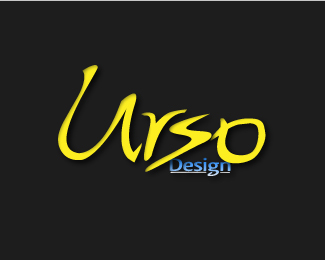
ReplyThanks for the feedback @theartistt..*Based on all the feedback I have recieved, I have put up a revision.. let me me know if I'm heading in right direction now.. Thanks Again Everyone!
Replytheurso - yes I was speaking of 'urso' only...I don't understand why you have to add 'design' into the logo. Simple urso would work fine in my opinion...if you upload a version like that, make sure to give it some equal spacing all around in the logopond template file and try to reduce the size of the U in relation to the other letters. the r can be pulled up, the s can be tucked in...I don't mean to tell you what to do, just random thoughts...hope you don't mind
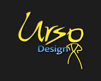
Reply@raja np, I really appreciate all the feedback, have you seen the newest revision I uploaded? Also I have design in there because I figured if %22Urso Design%22 is Company name then whole name should be in logo, is that an incorrect way to look at it? Again Thanks!
ReplyPlease login/signup to make a comment, registration is easy