Geodetics
by tass • Uploaded: Aug. 01 '09 - Gallerized: May. '12


Float
(Floaters:
23 )
Description:
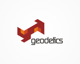
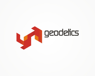
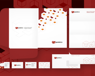
Logo design for Geodetics, a topography, real estate, civil engineering company.
You can see the stationery design on http://alextass.com/identity-design/branding-design
As seen on:
www.alextass.com
Status:
Client work
Viewed:
9738
Share:


Lets Discuss
When I looked at thumbnails I almost knew it was client option - the other 2 don't seem to be %22direct to the point%22 :-)
Replyhey...very good use of the cube font...good one..
ReplyThank you for your comments. Well Houston you are right to remind you of that. This version was a starting point and the shapes are a type, i don't remember if in this version i edited the type but i am very sure that this one it's pretty close to the original look of it. That's why i prefer more the other versions. :)**Thank you again.
ReplyI like this version best. Super use of the cube-as-3D approach. It could be an 'innie' -- could be an 'outie'....nice. %0D*
ReplyUPDATED: added new images showing concept variations and the stationery design.
ReplyI love it)
Replyreally looks great, Tass.
Replylovely style!
ReplyThank you all, and also thanks for the feature! :)
ReplyPlease login/signup to make a comment, registration is easy