Eventfull logo design
by tass • Uploaded: Aug. 29 '16 - Gallerized: Sep. '16

Float
(Floaters:
23 )
Description:
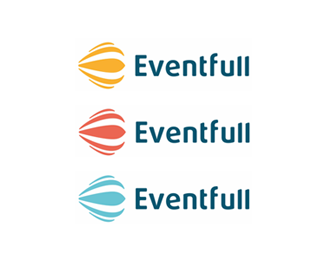
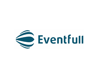
Logo design for Eventfull, an online web application focused on events planning and management: E letter mark, hot air balloon, smile.
As seen on:
http://alextass.com/
Status:
Work in progress
Viewed:
8032
Tags:
planning management
•
online and mobile applications
•
event industry
•
staff scheduling software
Share:

Lets Discuss
I don't know... Wouldn't a hot air balloon on it's side be bad? If not bad, at least not regularly seen that way, except when it's being filled with air. Seems a little like showing a car on it's end. I think if it was vertical it would be more recognizable as a balloon. Of course, then you lose the E and smile, but to be honest I don't think those are very apparent.
ReplyMy focus was on the colorful E @samdemastrie and with the balloon, it is vertically when it is raised and in air, but horizontal when it is inflating. This app is about planning and management, therefore I have considered a connection between the planning and the inflating of the balloon, both being stages before the main act itself (the event or the flight - also an event of it's own).
ReplyWhile I like your reasoning, it fails to reflect in the logo. I'm with @samdemastrie on this, the E is not obvious or even the smile unless I'm missing something? 3 curved fills are supposed to be the E? If so its too abstract for anyone to decipher without you mentioning it. Also an upright balloon would make sense so it works all across the board say for icons, pins, etc.
ReplyAn upright balloon would be just a cliche in my opinion, something that I did not intend to go for. Yes, it is abstract @cream5 , most of my work is abstract. And yes 3 horizontal lines tend to be interpreted or read as an E letter. The fact that other symbols, or messages are involved in the mark is just a plus to it, I did not intend people to necessarily recognize the balloon or the smile. They are there just as an extra.
ReplyNice to hear it @climaxdesigns perhaps I will add it. :)
ReplyPS. Thank you for the feature, very much appreciated as always!
Edit: that weird symbol thing. guess it won't read italics. What I meant was:
Reply@tass if you're reasoning for keeping it sideways is because 1. upright balloon is too cliche, or 2. for the sake of the E, then we can fairly assume E is non-existent so is the smile.
@cream5 as mentioned before, my main focus is the E letter done in a simple way using colorful stripes as @climaxdesigns mentioned. Everything else is extra. They are there, but as an extra, what I cared was only to have an abstract E letter mark.
ReplyI dunno. Each to their own. When I first saw this, yes I saw the balloon. That was obvious to me. And after reading Alex's description I thought it was pretty clever to incorporate the subtle E and smiles into it and once you do see the E, you can't really unsee it. As to whether the balloon being on its side being a negative aspect, I saw it as a suggestion that the event business is unlike any others in that it will do events 'outside the box'. Where others just plainly fly 'straight up', they also explore other directions that is more innovative.
ReplyWhy not a hot air balloon just carrying an E as the basket?
ReplyMmm... Such rich discussion! This is what it's all about.
ReplyBut Mike, just like the glass elevator, who wants to go just up and down? ;-P
ReplyWillie Wonka!
ReplyHaha, @samdemastrie I was just thinking that it's been a very long time since there were so many comments on one of my uploads haha :)
Reply@tass if you think it works as an E then I guess it does. From where I'm standing it doesn't and if anything the balloon is more obvious than an E shoehorned in there. Anyhow you seem happy with it and therefore we'll leave it at that. Cheers
Replywhat are your clients saying??
ReplyI really like this. Especially your concept about the inflation and planning!! I saw the balloon right away but had to read the description for the rest though.
ReplyThey approved this direction @logomotive
ReplyThey too wanted and considered to have the balloon in vertical position, but they have decided to go my way with it.
I got your point @cream5 although our opinions are different thanks for sharing yours as well.
Thank you @mistershot !
I do like abstracting the balloon idea. Love the type, very friendly.
ReplyHowever, the first thing my dirty mind saw was an abstract of the female genitalia on it's side. I can't un-see it now. Just thought you should know--playing devil's advocate and all.
Would hate for you to run into a scenario like Britain's problem with the OGC logo redesign in 2008. Same kind of thing. Here's a link to the Telegraph story if you're interested: http://www.telegraph.co.uk/news/1901656/OGC-unveils-new-logo-to-red-faces.html
Cheers
Please login/signup to make a comment, registration is easy