Description:
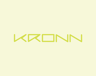
Naming and logo design project for a video tennis data platform aiming to inspire the tennis community with insightful and useful data.
What do you think about the name? (Chronos => Khronos => Kronn)
The custom type featured in the word mark / logotype was inspired / imagined as a tennis ball path (please check attachment).
As seen on:
www.alextass.com
Status:
Unused proposal
Viewed:
1870
Tags:
naming
•
brand name
•
word mark
•
logotype
Share:


Lets Discuss
KR seem a tab bit bolder than the ONN..Maybe add a little more character to O and N's? just my 2 cents.
ReplyThank you Mike, perhaps that's happening because K and R have some extra line which looks like it's giving them a little more width. I can't imagine at the moment how could I add it to the other ones to still look good. Thank you for your observation though.
ReplyPlease login/signup to make a comment, registration is easy