Description:
Logo design for GeoDiscover, a company that offers GIS (Geographic Information Systems) solutions, meaning spatial analysis and solutions designs using spatial context and data, IT solutions using creative and ingenious consultancy in hardware solutions, software solutions and web solutions, as well as their own line of products using custom mobile and web apps.
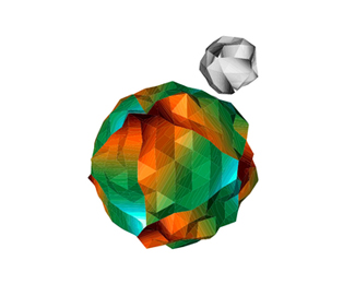
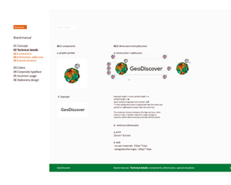
The symbol shows a small crazy low poly abstract planet, but, viewed at larger sizes you will see TIN (Triangulated Irregular Networks) and also topographic map details.
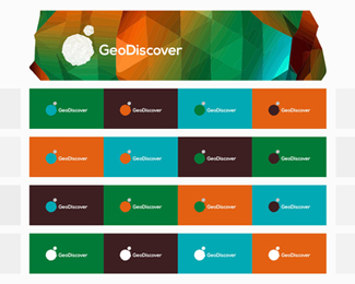
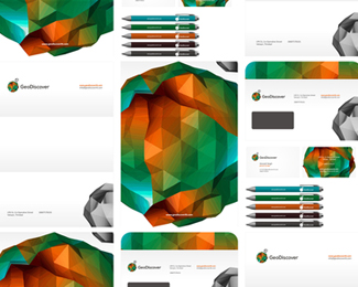
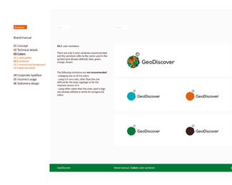
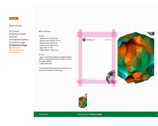
In the images you can see the full final logo, the symbol detail, the stationery design and the reversed color variations page from the brand manual.
Check out the Behance case study including the stationery design and the brand manual: https://www.behance.net/gallery/20560741/GeoDiscover-logo-design-identity-design-brand-manual
As seen on:
http://alextass.com/
Status:
Client work
Viewed:
9857
Tags:
logo
•
logo design
•
design
•
identity
Share:



Lets Discuss
This is some next level $8i !
ReplyThank you very much Gregory!
ReplyBrilliant work Alex! Do you have this presentation on behance as well?
ReplyThank you Norman, not yet, but I have in mind to prepare and publish it soon.
ReplyThank you for mentioning it. :)
Top notch work, Alex.
ReplyThanks Milou!
ReplyThank you again LogoPond for the feature, very happy about it!
ReplyNice work Alex! Floated! :)
Replylove the color,so unique!!!
ReplyThank you!
Replybaddass!!nice colour composition. love it
ReplyPlease login/signup to make a comment, registration is easy