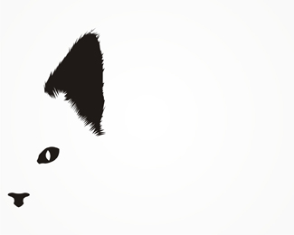
Description:
work in progress. any suggestion on how can i improve it?
As seen on:
www.alextass.com
Status:
Just for fun
Viewed:
5435
Share:

Lets Discuss
I think it's great. As for suggestions of improvement. . .**I'm not sure. For me, as far as I'm concerned, and this is just me, I would try to simply the ear so that it's not as dependent on the fur. I only say that, though, because I like logos to not only look great and capture the company or product, but also be simple enough for folks to draw by hand. After all, we want people to keep thinking about our logos, to the point where they want to make something as good. It's a great design. I would only simplify the ear.
Replythanks for the comment. i think i understand what you mean but the 'model' for this was my own cat, so i have respected her 'aspect ratio' and ear fur style :) i have tried also a less detailed ear but i liked this version more, i think it gives it a more natural look
ReplyWell, it looks great, and if this is what you wanted, then it's just perfect. Of course, we don't want to disappoint your cat. :-) It's one of the best logos I've ever seen. It's bold, and it really says a lot. You did well.
ReplyOne of my favs from you. %3B)
ReplyThank you filipev, i like many of yours (too)! :)
ReplyPlease login/signup to make a comment, registration is easy