Description:
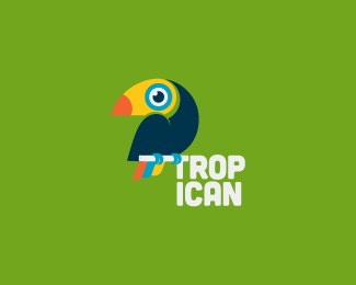
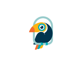
I've wanted to make quite a simple toucan, but I kind of got stuck with a half-baked mark. At first the toucan had a heart-shaped wing, but I saw another logo with the same gimmick, so I ditched it. However, it seems to lack something on its own, but I can't figure it out. I don't think the first image is quite practical and the second seems unfinished. Any advice?
As seen on:
crumbit.wordpress.com
Status:
Work in progress
Viewed:
4351
Tags:
tropical
•
toucan
•
bird
Share:
Lets Discuss
Tanja, without knowing what the brief requires, its hard to critique what is 'missing' from the mark or lack thereof. But atm, I think its a fantastic looking toucan and one that stands out from the rest. I particularly like the other one that is sitting on a perch.
ReplyIs toucan the bird of the month? Replacing the owl? ;^]
Norman, thank you so much for the kind words. This wasn't done for a client, just my personal idea. I think I prefer the second one too, but feel that the perch is kind of missing something. Maybe I'm wrong.
ReplyAnyway, you might be right. Seems like toucans are gaining popularity.
but the idea of the toucan perched on the writing is brilliant
ReplyThanks, Manu! For practical reasons I went with the perch (as you can see on my blog). But this one's fun also.
ReplyGreat works !
ReplyThank you, Kapil!
ReplyPlease login/signup to make a comment, registration is easy