Float
(Floaters:
7 )
Description:
Just a concept i came up with...its for sale on inspring...
Status:
Nothing set
Viewed:
3857
Share:



Lets Discuss
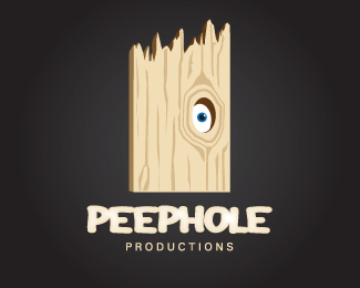
i think this is awesome. the top of the board seems a little too jagged and the type doesn't seem to work, too puffy?
Replyi was going for kind of a Porky's type font (without using Porkys) and i chose to go that way because the 'peeking through the hole' was a big part in that movie....i thought it might be fitting....if i get some more opinions i might change it.....%0D*%0D*the top could definately be changed...i just didn't want it to be straight across. do you thinkn it should be just less jagged or totally straight? or pointed up like the top of a fence?
Replyhard to say what to do with the top. I was imaging almost 2 fence posts next to each other, flat on top, with a difference in height. I think of a tree trunk when I see the jagged top, but who's to say it won't look like a tree trunk flat? %0D*%0D*Or make it less jagged, like you said. less like it was torn off. Sorry, not much help.%0D*%0D*I think it may be hard to connect Porky's to peephole, IMO. There are other 'visuals' that come to mind when you think of Porky's, and right now I can't picture the type.
ReplyPlease login/signup to make a comment, registration is easy