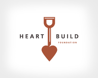
Description:
Building a healthy heart initiative. Art director, designer, illustrator, James Strange. Copyright, James Strange.
Status:
Nothing set
Viewed:
13057
Share:



Lets Discuss
Looks great - nice one
Replyyeah great piece!
ReplyThis is very nice. The heart portion looks a bit flat in comparison to the rest of the logo. Perhaps a more prominent highlight to mimic the handle and neck of the shovel. This may make it more distracting, but I'd be interested to see the result.
ReplyI %22dig%22 this. I agree with alto, though. Try a version adding some dimension to the spade portion. Also, maybe try increasing the word %22Foundation%22 to be the same width as %22Build.%22 Looks great otherwise.
ReplyGreat suggestions. Thanks.
ReplyAce.
Replybingo*
Replyexcellent work!!
ReplyVery nice, great work!!
ReplyI dig it!
Reply@cesafacamah: Why? What would you change? Just saying you don't like it isn't very constructive.**I think this is awesome, by the way.
ReplyJames, I love your stuff. Execution and all. Maybe I'm the only one who feels this way but my mind relates this logo to death, as in diggin a grave and putting to rest. Perhaps if the heart shovel was pointed upwards? Maybe I'm just overthinking...
ReplyAnd I do understand the shovel as far as breaking new ground goes.
ReplyLove the design how it is, but Mike prompted an idea. You could also use a regular shovel base and incorporate a heart into the handle.
Replylogomotive said:**James, I love your stuff. Execution and all. Maybe I'm the only one who feels this way but my mind relates this logo to death, as in diggin a grave and putting to rest. Perhaps if the heart shovel was pointed upwards? Maybe I'm just overthinking... **Thanks. I do respect your opinion and your work. You nailed the metaphor, break new ground and the start of building as it were.
Replyman i love your stuff. . . great work
ReplyReally nice!
ReplyPlease login/signup to make a comment, registration is easy