Float
(Floaters:
79 )
Description:
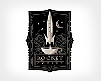
Coffee shop in a victorian building.
Status:
Nothing set
Viewed:
12707
Share:






Lets Discuss
Cool, but kind of a strange combo considering rockets didn't exist in the Victorian era.
ReplyYou've got a great style dude.
ReplyI appreciate all of the positive feed back. As for the rocket, yes, but they had dreams of one. Don’t we all.
ReplyOnly suggestion is to see about making the descender on the R and K in rocket the same style, either straight or curved. Otherwise, nice design.
ReplyLooks great.
ReplyI absolutely buzz off this type of retro styling and judging from your portfolio youve got it nailed :) Great work dude.
Replyelegant
ReplyReally nice! Not too sure about the font though!
ReplyI love rockets - and this one is a beauty. Great detail. Great logo.
Replyvery interesting concept
ReplyYou have some very nice work, I appreciate your artistic style.
ReplyCongrats on the feature.
ReplyVery nice! I agree with pram, though - the rocket could have been less 50's and more steampunk....
Replygreat mark/ illustration. . . I can totally see this being extended into the packaging, environment and more. Great.
Replywow .. elegant and unusually beautiful!!
ReplyLooks like an African mask. Beautiful logo.
ReplyReally like it, great Idea, well done Broth
ReplyWow! This is really, really nice. Well done.
ReplyVery Cool! I really, really liek it!
Replyvery nice. great style for coffee.
ReplyThis logo really hit me late. I saw it a few days ago - but I kept thinking about it. Now I really like it. Good strong brand.
ReplyI frikin love it!!! Love the look of the art. I wonder if their is some way to make the copy bigger, or if that should be tried. Well done!
Reply%22less is more%22 when it comes to logos but this is ... wow.*/clap for all the details! you can tell that there was couple hours in this*With some classic font from 40's (Bioshock-like :) this would be 10/10
Replyelegant.
ReplyGreat work..however all I keep seeing is a guy (moon and stars making the eyes) blowing his nose (the rocket) into a cup (mouth). lol
ReplyYou are one talented cat. Love your entire showcase, and the detail with this one is great.
ReplySimply fantastic :)
ReplyI normally don't like this style of logo at all. However, this is great work. You nailed it. I'd buy coffee here.
Replyahhh i can just imagine this hanging outside the cafe on a black decorative metal hook. Congrats this is wonderful!
ReplyFantastic work. I just couldn't get the rocket coming out of a tea cup idea (this is for a coffee house isn't it?) :P
Replymy fav :)
ReplySomething great illustrative
ReplyPlease login/signup to make a comment, registration is easy