Float
(Floaters:
2 )
Description:
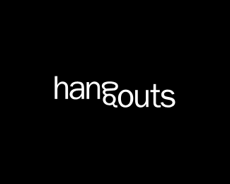
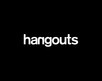
This is a first version of a logo for hangouts website.
Status:
Nothing set
Viewed:
3199
Share:


Lets Discuss
I' not really feeling the font used but i like the idea of the hanging %22outs%22. I would keep a font with a similar G but more like your second revision.
Replyhows about taking out the 'o' in outs %26 just using the bottom part of the 'g' as the 'o'? leave it hanging upside down like it is, just use the 'g' for both the 'g' in hang %26 'o' in outs... sorry for repeating myself im just trying to make sense to you %3B)
ReplyThank you all for practical and good comments. To bad client doesn't fell that splitting of hangouts word in two visual segments, even though it came out from two words.**Anyway, I'm not going to work on it since I have to go with clients directions. Maybe I'll try what %3Cb%3Enido%3C/b%3E said just so see how it looks.**Thanks again. It's really nice to be here.
ReplyPlease login/signup to make a comment, registration is easy