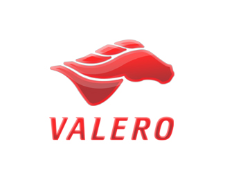
Description:
New logo and type redesign for the Valero Gas station. A stylistic mustang running through the wind was a nice nod to the Texas company looking to reposition themselves from a cheap gas station towards a more premium fuel choice. Gloss version and flat version were created for web and print application. Web version shown here.
Status:
Student work
Viewed:
3259
Share:


Lets Discuss
Please login/signup to make a comment, registration is easy