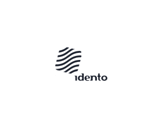
Idento Coloured
by sonic • Uploaded: Jul. 29 '08

Float
(Floaters:
14 )
Description:
logo for an upcoming identity design agency in germany
Status:
Nothing set
Viewed:
2429
Share:


Lets Discuss
It reminds me of the works of dache. I like it.
Replyiwas just going to say the same - he is known for these colorful odd shaped symbols. although this one is quite nice!
ReplyIt must be reminding you due to the same color scheme and almost the same name used..**http://www.dache.ch/portfolio/logo/invento
Replyso, this is basically a ripoff?
Replyhaha... he seriously color sampled each line from dache's...
ReplyI prefer this one sorry even thought it's a bit ripped off
ReplyMaybe it's just a coincidence that the colours are the same/similar. Perhaps they both have great taste. Either way I am jealous
ReplyI really like it, but it is incredibly similar. What are your thoughts dache?
Replyin illustrator you can load libraries of swatches. In the latest version there is an online library called Kuler, where you just need to type in a keyword and it comes out with sets of swatches. **Maybe its a coincidence... though the colors really do match %5E%5E
Replycome on guys would someone really be that silly to rip off another logo's colours and post it on the same website?? I'd like to hear from sonic. Until then, go easy!
ReplyI'm just asking, not syaing it is. Because of what dache said*also the form o the logotype itself doesn't remind dache's *aurel might be closer then we do: maybe its the same pre-made swatche :%5C
ReplyI'd say at least the colours have been sampled from dache's. The name is a coincidence I would imagine.
ReplyAm not going to say anything. But from beginning I though that was Dache's work from View All. sorry sonic
ReplyAt first: Why should i rip a logo and then put it on the same site?? thats not what design is all about, i think. %0D*But what design is about is that sometimes logos look similar, especialy when they are that simple. %0D*%0D*And yes, the colours look very very close the same. But thats a pattern, not daches, i have used just to show the logo in colour. It could also be green or pink or poo brown. doesnt matter. If a rainbow is copyright by Dache, ok im sorry.%0D*%0D*The square shape supposed to be a fingerprint. Because of the name: Idento - Identity Design. And this name was also not a rip of. How stupid would that be?!%0D*Idento was named by 3 students in D%FCsseldorf, not me. Maybe they ripped, but the name is arroud for years...%0D*%0D*but thanks for the feedback :%3E %0D*
ReplyFirstly, sonic....lovely mark.**I actually thought it looked a bit like one of dache's logos on first inspection...but like many have said, you can't copyright a colour palette or the minimalistic approach used here and the type doesn't look like one dache would use **Secondly, everyone should just stop being mean :P*
ReplyUh oh, I didn't meant to start any controversy. Just saying that this logo had a similar feel to the works of dache. In black and white, they are completely different. Unfortunately, dache has started sort of a trend with his bright and bold color gradients. People are sure to do the same thing. I'd consider it a compliment. But seriously, I'm with Climax, this is not a rip. Just similar names and a similar color palette.
Replylol .... cant help but chuckle when i read these .... great voice Climax with you .... **Nice mark great colours ... name , the mark and the colours basically giving me a foot/thumbprint of what the brand is and does .... not to add fuel on a fire but methink some prescriptions are in order .... **and if something looks like the style of someone else's surely thats a compliment especially if a respected designer.....
ReplyLol ... not really ... i wrote three drafts ... opted for a bottle of heineken .... while writing and without thinking - still would seem like a compliment ... but ah well .... such is life .... **Someone once wrote to me that for some insane reason, bearing in mind i could be a good designer - i should be careful what i say, and i must say it makes as much sense then as now.... (hopefully i have protected his identity :) ) With a little humility since certain people did not create shapes, colour schemes - take the praise given or not and enjoy. Whilst it doesnt really end there since ... certain people post comparison baiting or even asking for his opinion .... heheehh feels like im watching lord of the flies .... but hey now im fanning a flame ... but its great still to see open minds in here .... **end of sermon lol ... anyone else want a brew ?
Reply%5E Yeah, what a great flick, now that I remember.
Replymost definite .... awesome flick ....
ReplyGood support Climax. :) no doubt sonic appreciates it. Clashmore, ease up on the sarcasm, you've made your point.
Replymy apologies then.
Replyfeel the love
Replymagnolia flick looks interesting
ReplyPlease login/signup to make a comment, registration is easy