Granite Tops Ilreand
by sipherlucian • Uploaded: Nov. 29 '07

Float
(Floaters:
2 )
Description:
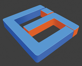
Logo designed for granite worktop company
As seen on:
www.granitetops.ie
Status:
Nothing set
Viewed:
1631
Share:


Lets Discuss
Pretty cool idea. Nice perspective, font and dimension. I can totally see the %22t%22.**But... the %22g%22 Does look like a 9 right away and the colors and feel of the mark don't really say granite to me.
Replythanks for the comments, have to change the %22g%22 anyone else have anything to say about it? any advice is appreciated
ReplyI like the kitchen idea. Just a thought... have you tried a cap G and possibly a negative space T. The colours could be more 'granite like'
ReplyYeah I agree, the colours aren't really granite like. Try some cool greys.
ReplyPlease login/signup to make a comment, registration is easy