Description:
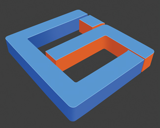
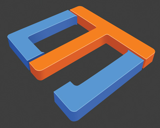
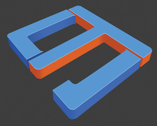
hi looking for advice i uploaded this logo yesterday got great advice for it so ive changed it, reason for blue and orange was blue for professional work and orange for reasonable prices, plus client liked it. granite worktops ireland
Status:
Nothing set
Viewed:
1377
Share:

Lets Discuss
Nice perspective.. I clearly see the G and the T.
ReplyI see that you're a 3d modeller, so you prob use Viz or 3dsmax or some other 3d app, but if you really want to expand into graphic design then you should mix it up a bit and not use the 3d app so much. The logo would look good as a flat vector in illustrator and in illustrator you would also have more control over text, layout and colour for printing. The 3d look is all well and good, its a feather in your cap, but sometimes its a little over kill. Simplicity works best more often than not. Why not go 2d once in while, lose a dimension just to see how it feels! %3B)
ReplyPlease login/signup to make a comment, registration is easy