Description:
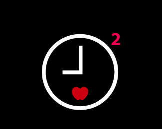
Logo redesign proposal for Times Square Alliance. Part of this logo is explicit: the clock, for Times; the 2 (square), for Square; the figure below, a heart-apple (heart, for the famous campaign of Milton Glaser, "I Love NY"; apple, for New York's nickname, The Big Apple; shows, that way, two icons of the New Yorker culture), for Alliance. The time shown is nine o'clock, complemented with the black background, visualizing the nocturne image of the Times Square. The chosen colors allude to the brilliant and representative electronic advertising billboards [...].
Status:
Nothing set
Viewed:
2288
Share:


Lets Discuss
Why not make a square clock instead of a circle? You could leave the 2 out that way, that will be prettier if you ask me.
ReplyI think the bright pink and the red clash.**Also, the heart/apple shape doesn't grab me as being either. Quite a challenge, no doubt, to make it say both... maybe try something side-by-side?
ReplyI like their current logo if you ask me.
ReplyYglo: if I made the a square clock, it wouldn't show the uniqueness of the the Times Square.**dynamite: well, it should __clash__, as all the advertising around. I don't know what to tell you about the he heart/apple, because it has been clear to the people I've showed it.**xzentrico: I think it's ok, but don't think it's as representative and unique as it could be.**Thank you for the comments.
ReplyPlease login/signup to make a comment, registration is easy